Use Case
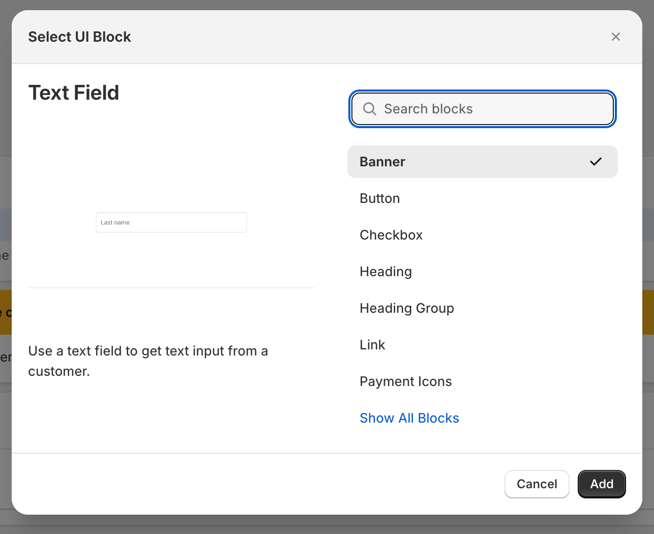
The Text Field widget allows you to collect additional information from customers on the checkout page.
Text Field Properties


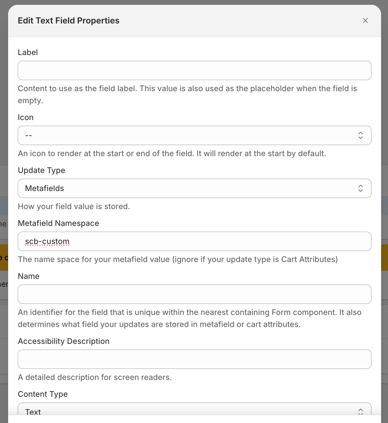
Label
Content to use as the field label. This value is also used as the placeholder when the field is empty.
Icon
This property allows you to specify an icon to render at the start or end of the field. It will render at the start by default.
Update Type
This specifies how your field value is stored.
Metafield Namespace
The namespace for your metafield value. Please ignore this if your update type is Cart Attributes.
Name
This is an identifier for the unique field within the nearest containing form component. It also determines what field your updates store in metafield or cart attributes.
Accessibility Description
This enables you to add a detailed description for screen readers.
Content Type
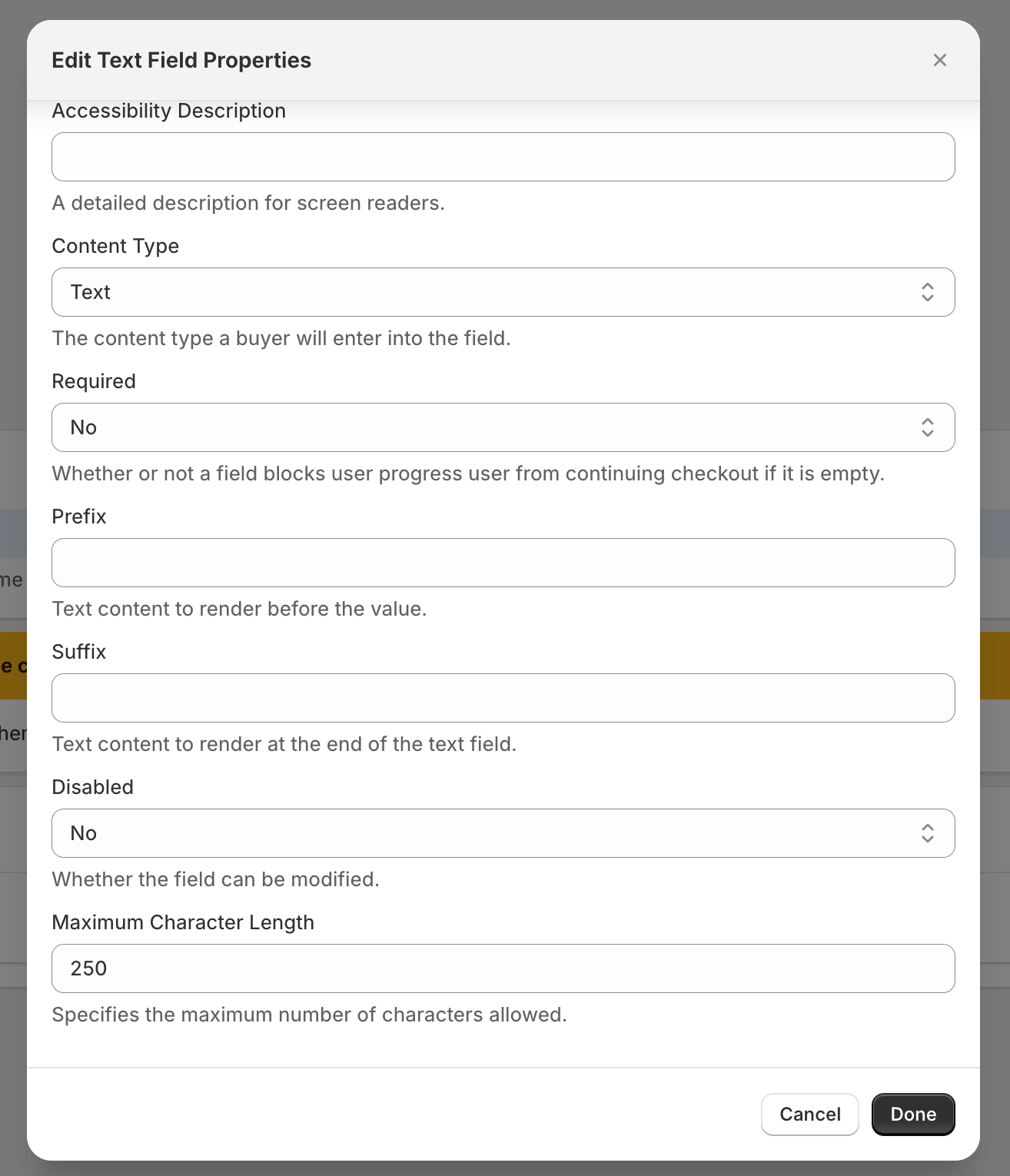
This helps you specify the content type a buyer will enter into the field. This can be a text, email, number, or phone number.
Required
This property helps you specify whether or not a field blocks the user’s progress user from continuing checkout if it is empty.
Prefix
This property enables you to add text content to render before the value.
Suffix
This property allows you to add text content to render at the end of the text field.
Disabled
This property specifies whether the field can be modified.
Maximum Character Length
This property helps you specify the maximum number of characters allowed in the text field.
All Widgets and their children use cart conditionals to help hide/show based on conditions. Click here to learn more.
