Use Case
Icons provide clear visual cues to customers. They can help to make the text on your checkout page more intuitive. It also enhances readability by breaking up long text.
How to add the Icon Component
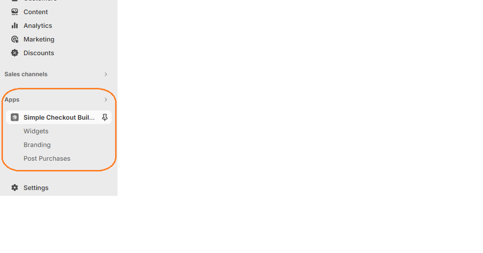
1. Login in to your admin dashboard and look under the Apps section in the left side panel. Locate the Simple Checkout Builder app.

2. Click on the New Widget button then enter the name of the widget. Next, click on the add button under Widget Editor to add any widget of your choice.
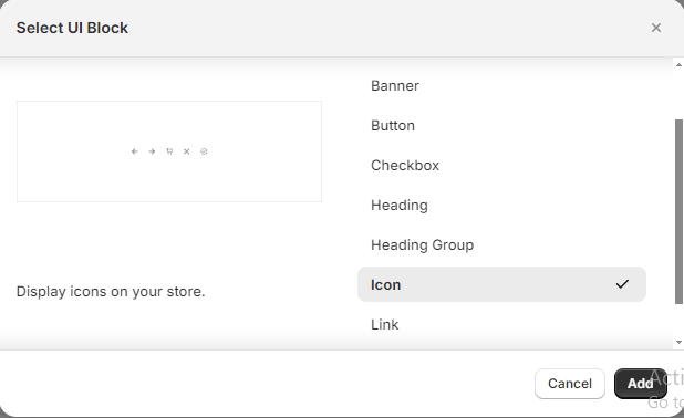
3. From the widget menu, select the Icon block and click the Add button at the bottom right.

Properties
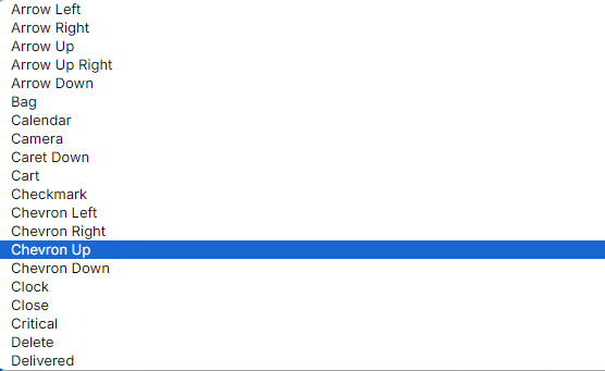
Icons
Here you can select the icon you want to be displayed.

Accessibility Label
This label will be announced to visually impaired buyers using assistive technologies to access your site. When set, any nested UI Blocks in this component will not be announced to screen reader users.
Color Scheme
This property sets the icon’s color.
Examples:
Setting the icon color scheme to subdued:

Setting it to critical:

Setting it to Base

Icon Size
Adjust the size of the icon. The options for icon size are Fill, Small, Extra-Small, Base, and Large.
Icon Id
Provides a unique identifier for the icon widget.
