Use Cases
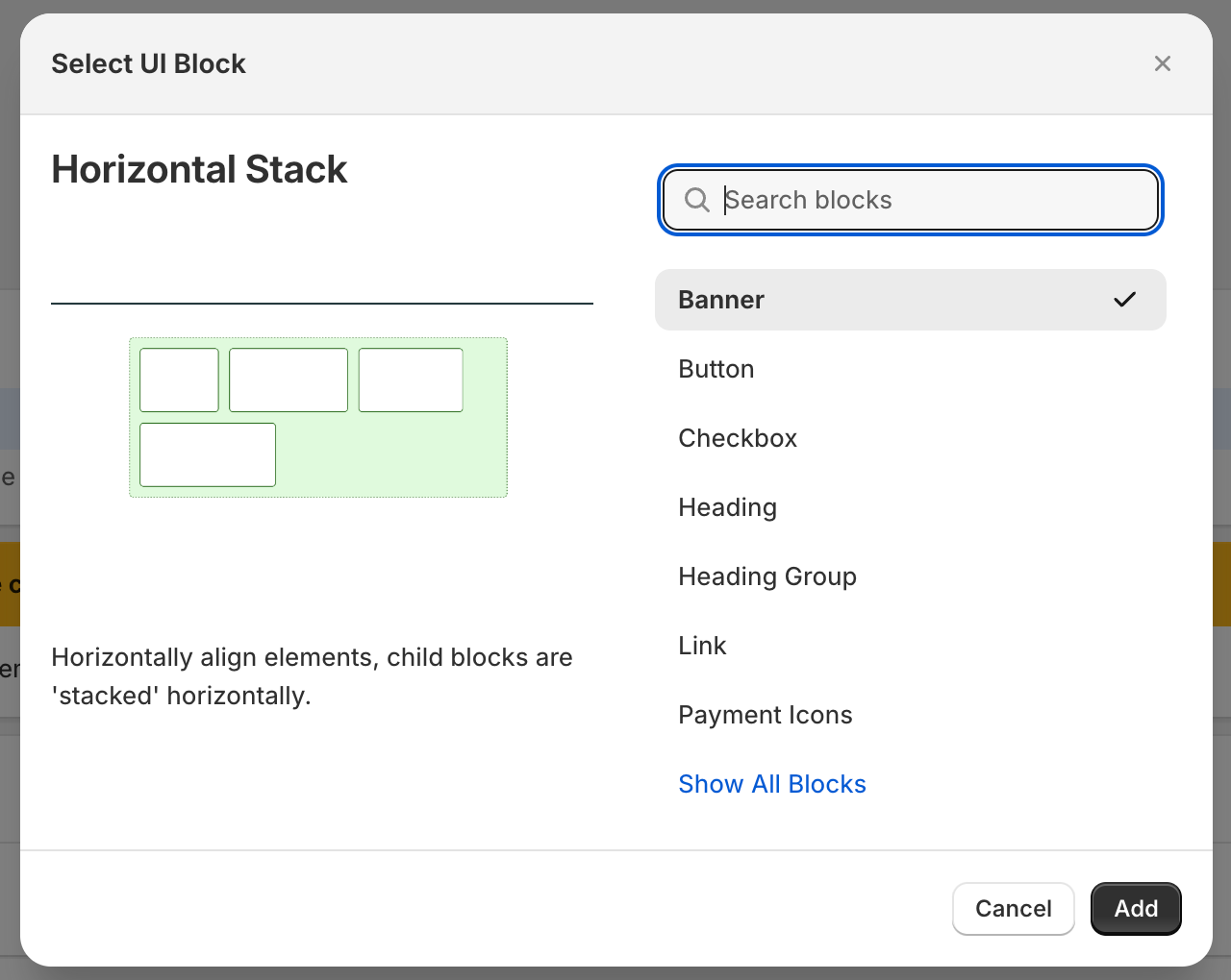
The Horizontal Stack widget allows you to horizontally align the elements on your checkout page, the child blocks are stacked horizontally.
Horizontal Stack Properties


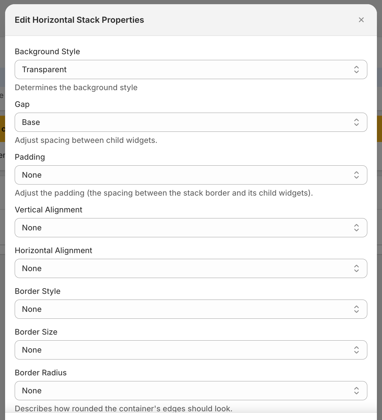
Background Style
This property lets you choose the background style
Gap
This property allows you to adjust the spacing between child widgets.
Padding
You can adjust the padding — the spacing between the stack border and its child widgets using this property.
Vertical Alignment
This property specifies how child elements will be aligned vertically.
Horizontal Alignment
This property specifies how child elements will be aligned horizontally.
Border Style
This property allows you to define border style
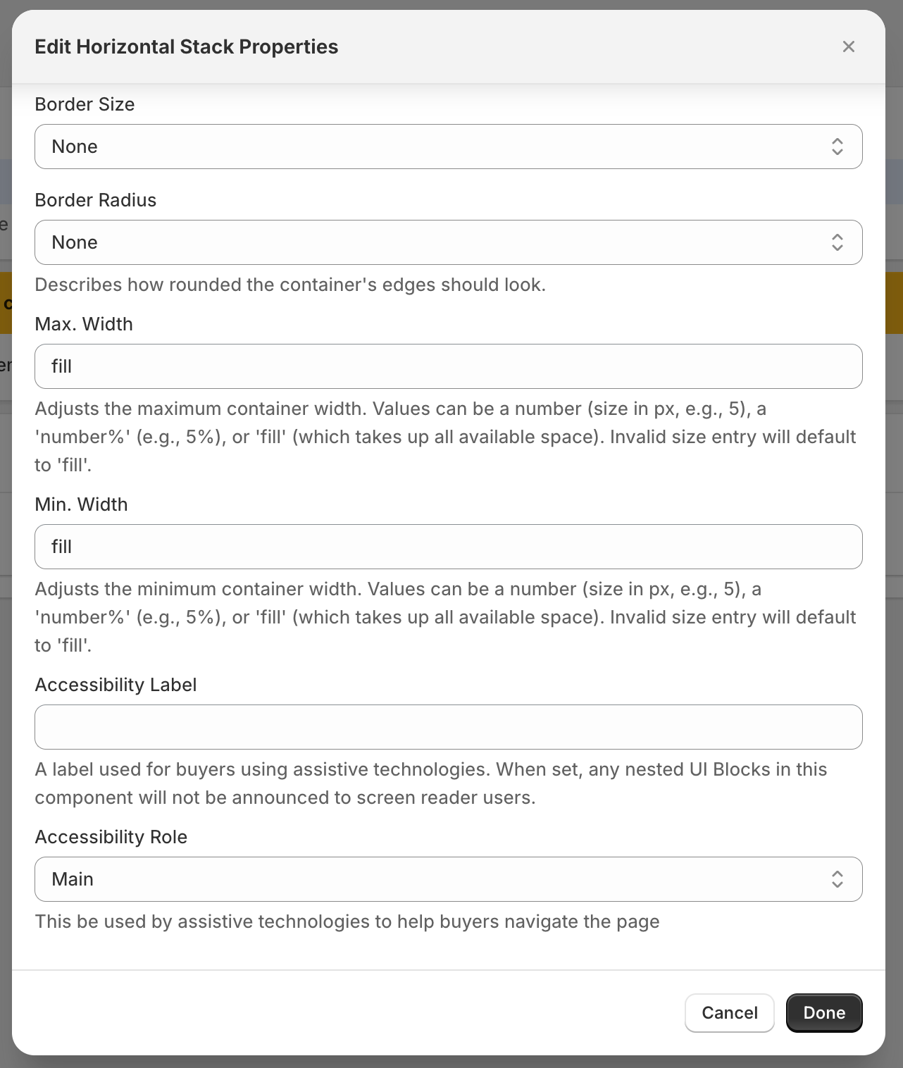
Border Size
This property allows you to define the size of the border.
Border Radius
This property lets you define how rounded the container’s edges should look.
Max. Width
This property lets you adjust the maximum container width. Values can be a number (size in px, e.g., 5), a ‘number%’ (e.g., 5%), or ‘fill’ (which takes up all available space). Invalid size entry will default to ‘fill’.
Min. Width
This property lets you adjusts the minimum container width. Values can be a number (size in px, e.g., 5), a ‘number%’ (e.g., 5%), or ‘fill’ (which takes up all available space). Invalid size entry will default to ‘fill’.
Accessibility Label
This property lets you add a label for buyers using assistive technologies. When set, any nested UI Blocks in this component will not be announced to screen reader users.
Accessibility Role
This property will be used by assistive technologies to help buyers navigate the page.
All Widgets and their children use cart conditionals to help hide/show based on conditions. Click here to learn more.
