Use Case
Headings are used to introduce major sections such as ‘Shipping address’ and ‘Contact Information’.
How to add the Heading Component
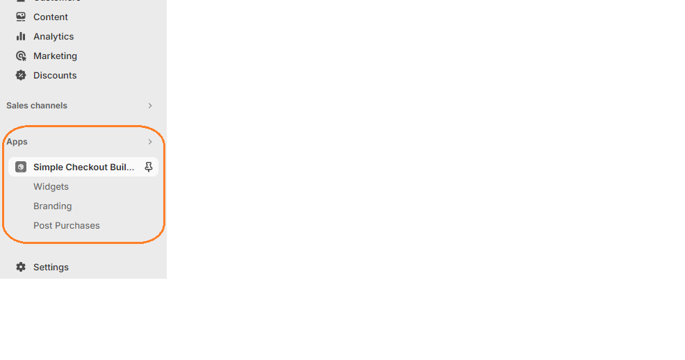
1. Login in to your admin dashboard and look under the Apps section in the left side panel. Locate the Simple Checkout Builder app.

2. Click on the New Widget button then enter the name of the widget. Next, click on the add button under Widget Editor to add any widget of your choice.
3. From the widget menu, select the heading block and click the Add button at the bottom right.
Properties
Heading Content
Displays the text in the heading.
Heading Level
The visual level of the heading. When not defined, the heading will use its “automatic” heading level, which is determined by the level of nesting within parent Heading Groups. No matter what value you provide here, the semantic level (e.g., how the heading contributes to the document outline) is determined exclusively by the “automatic” heading level.
Horizontal Alignment
Aligns the heading to the left, right or center.
Accessibility Role
This indicates the semantic meaning of the heading. This helps buyers using assistive technology to adequately navigate the page.
For further customization of the heading levels styling, please visit the Checkout branding menu
All Widgets and their children use cart conditionals to help hide/show based on conditions. Click here to learn more.
