Use Case
Use banners to prominently display key messages to customers.
How to add the Banner Component
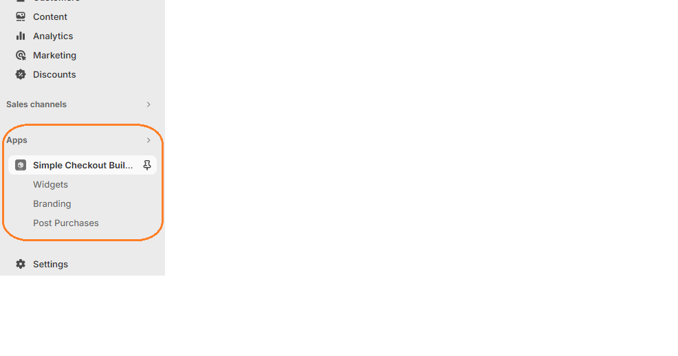
1. Login to your admin dashboard and look under the Apps section in the left side panel. Locate the Simple Checkout Builder app.

2. Click on the New Widget button, then enter the name of the widget. Next, click on the add button under Widget Editor to add any widget of your choice.
3. From the widget menu, select the banner block and click the Add button at the bottom right.
Properties
Banner Title
The Banner’s title is optional. Titles should be brief and punchy to get the buyer’s attention
Banner Type
The Banner type can be Info, Success, Warning or Critical.
- Use the Info Banner to notify or advice buyers.
- Use the Success Banner to indicate a successful or positive result.
- Use the Warning Banner to display information that the buyer needs to attend to. Endeavour to use this banner sparingly as it can stress buyers out when used excessively.
- Use the Critical Banner to indicate issues which the buyer needs to solve before they can checkout.
Collapsible
Makes the content collapsible. A collapsible banner will conceal child elements initially, but allow the user to expand the banner to see them.
All Widgets and their children use cart conditionals to help hide/show based on conditions. Click here to learn more.
