Use Case
Use buttons to trigger an action or enable buyers to navigate to the next steps.
How to add the Button Component
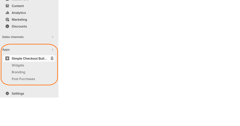
1. Login to your admin dashboard and look under the Apps section in the left side panel. Locate the Simple Checkout Builder app.

2. Click on the New Widget button then enter the name of the widget. Next, click on the add button under Widget Editor to add any widget of your choice.
3. From the widget menu, select the button block and click the Add button at the bottom right.
Properties
Text Content
Plain (non-styled) text to be shown in the button.
URL
Destination URL to link to. If this value is set, the button will render as a link.
Button Type
The type of button that will be rendered. The visual presentation of the button type is controlled through your Branding API.
- Use Primary button for main actions such as ‘Continue To Payment’.
- Use Secondary button for secondary actions such as ‘Download Shop App’.
- Use Plain button to render a button that looks like a link
Color Scheme
Specify the color treatment of the Button.
Horizontal Alignment
Aligns the button to the left, right or center.
Accessibility Label
A label used for buyers using assistive technologies. When set, any nested UI Blocks in this component will not be announced to screen reader users.
Accessibility Role
The role of the button that will be rendered :
- Button: renders as a button.
- Submit: renders a button that submits a form.
For further customization of the button component’s styling, please visit the Checkout branding menu.
All Widgets and their children use cart conditionals to help hide/show based on conditions. Click here to learn more.
